#1
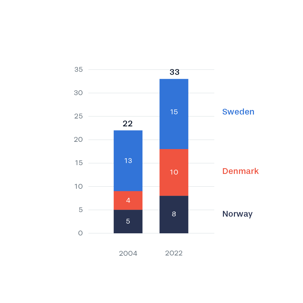
A traditional stacked bar chart. Easy to read and a rather efficient data visualization. The primary focus is the comparison of the total number of World Heritage sites now and then. Secondly, you are able to compare the individual countries.

