About
Beyond best practice
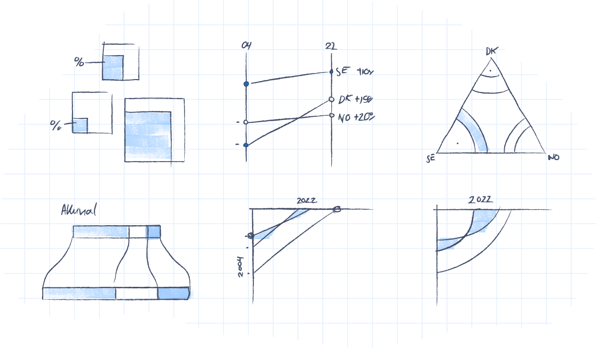
Every time we turn a set of data into a visual depiction, hundreds of design choices have to be made to make the data tell the best story possible. Many of the choices are unconscious, often resulting in similar solutions. The obvious and uninspired. This project goes beyond common solutions and best practice. It demonstrates how even the simplest dataset can be turned into 100 proper data visualizations telling different stories, using very limited visual properties and assets.
Enlighten people to make better choices
This project is not made to show off, but rather show how interpretation can create better results. Take a close look at your dataset, and figure out what the main story in your data is. Different approaches and focuses demand different visualizations. We decided to keep every visualization the same style and colors and let the interpretation and story angle dictate the visualization. This resulted in 100 vastly different visualizations.
Simple yet functional
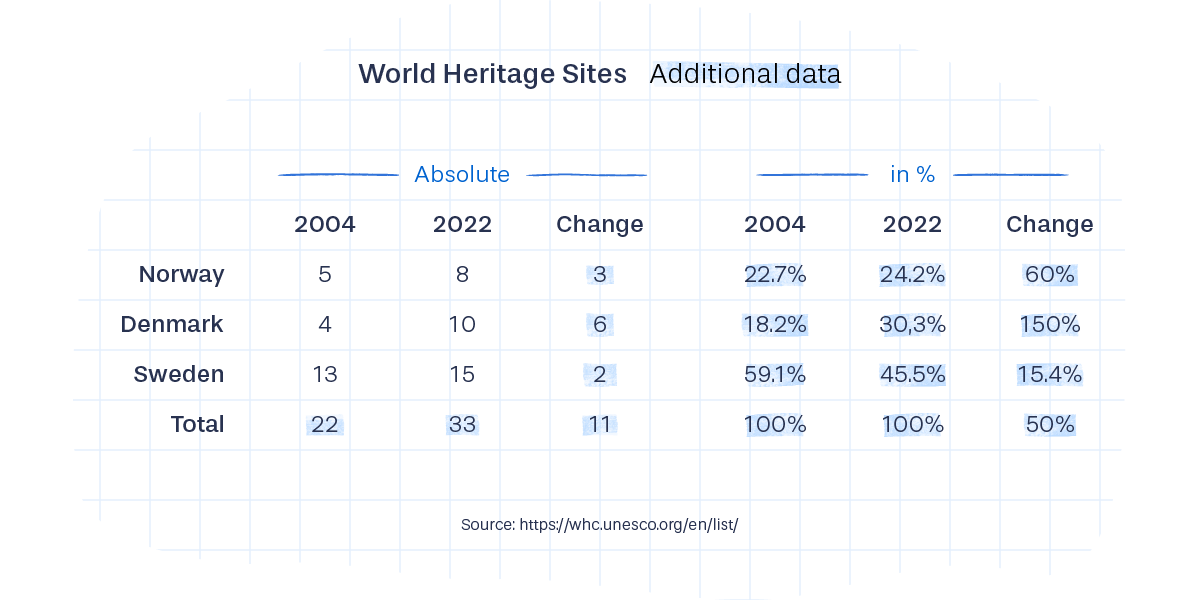
For the challenge we chose a very simple dataset – although complex enough for interpretation. The dataset includes multiple statistical aspects such as comparison, development, distribution, etc. The dataset compares the numbers of UNESCO World Heritage Sites in Scandinavia in 2004 and 2022.
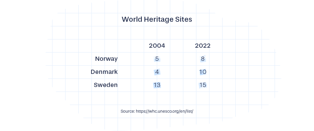
From the dataset we deduced the total, average, perceptual change and perceptual distribution, which gave more possibilities for approaching the dataset from different perspectives. The story could be on the development of total Scandinavian national heritages or focus could be that Sweden has significantly more than the rest both then and now. Or the fact that in a few years Denmark surpassed Norway.
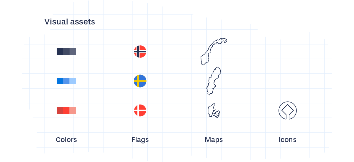
The visual toolbox
For the data visualizations, only a small selection of very basic visual properties were used to transform data into visual: scale, length (height/width), position, and amount.
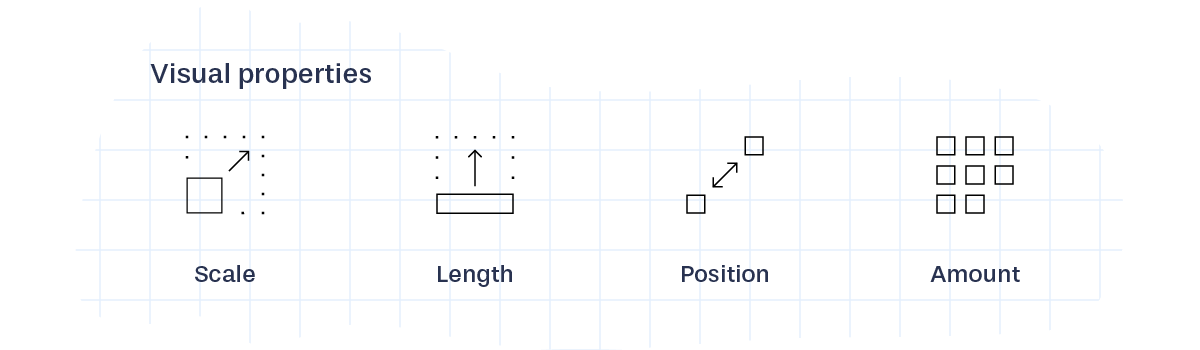
A limited set of visual assets were also used: colors, shades, flags, maps and the UNESCO World Heritage icon. Mostly for visual differentiation and labelling. This constitutes a limited yet powerful, visual toolbox, large enough to come up with 100 visualizations.
Data Viz Project
This website is part of Data Viz Project, our collection of data visualizations to get inspired and find the right visualization for your data. You can follow Data Viz Project on Instagram and Facebook.
Please let us know if you find any errors, bugs or you simply have suggestions for the website in general. We would love to hear what you think!
The people behind it
We are Ferdio – an infographic and data visualization agency in Copenhagen. We transform data and information into captivating visuals. We add value to data and information by telling visual stories that inform and inspire.
Copyright
Data Viz Project is copyright Ferdio and available under a Creative Commons Attribution – Non Commercial – No Derivatives 4.0 International license.