#14
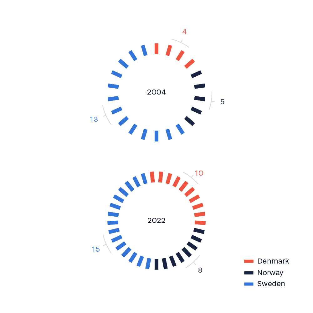
The visualization can be interpreted as a donut chart depicting the distribution of World Heritage sites between the countries. Furthermore it includes a visualization of the absolute number of World Heritage sites. This means that the density of radial lines is bigger in 2022 than in 2004.

