#38
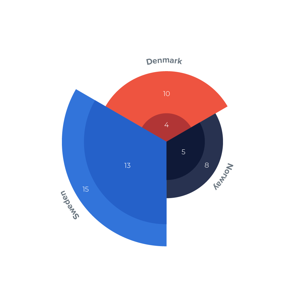
The data visualized as a polar area chart (also called a Coxcomb chart). Each sector represents a country and the years are represented by how far each sector extends from the center of the circle.
The data visualized as a polar area chart (also called a Coxcomb chart). Each sector represents a country and the years are represented by how far each sector extends from the center of the circle.

