#10
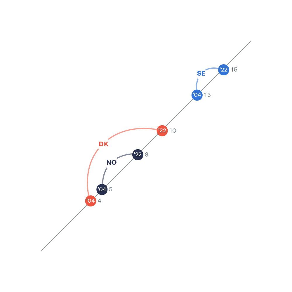
On a one-dimensional diagonal axis, the countries are plotted in as dots. Both years and country names are integrated into the chart. The visualization is focused on progress and highlights how Danmark has surpassed Norway, while Sweden only had limited progress.


