#2

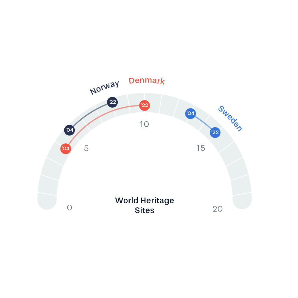
A great visualization for the purpose of visualizing the progress for each country. By focusing on the progress rather than the total values, we clearly see how Denmark surpassed Norway. The gauge-like layout adds an interesting alternative visual approach.

