#20
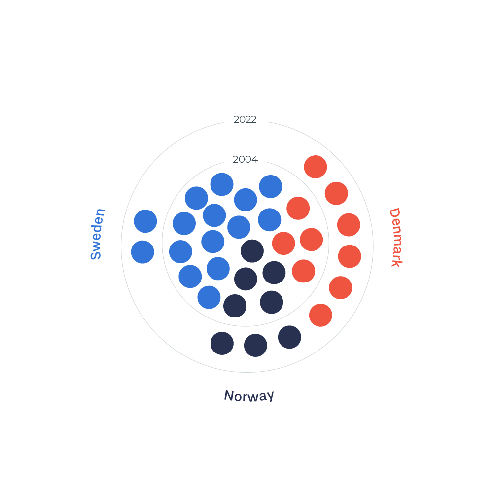
Each dot represents a World Heritage site and the years are divided by the circles from inside to out. This data visualization gives an overview of the distribution, and the actual numbers are only visible if you count the dots.
Each dot represents a World Heritage site and the years are divided by the circles from inside to out. This data visualization gives an overview of the distribution, and the actual numbers are only visible if you count the dots.


