#49
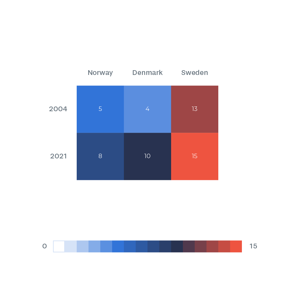
Heat map of the dataset. Red indicates most World Heritage sites and white or light blue least World Heritage sites. The dataset is arguably too small for a data visualization like this to make sense.
Heat map of the dataset. Red indicates most World Heritage sites and white or light blue least World Heritage sites. The dataset is arguably too small for a data visualization like this to make sense.
