#67

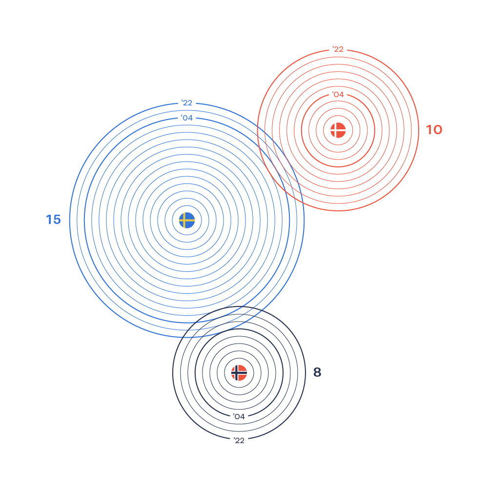
This may seem like a proportional area chart, but it is actually the number of rings that represent the number of World Heritage sites. The rings count from inside to out, and the years are highlighted.

This may seem like a proportional area chart, but it is actually the number of rings that represent the number of World Heritage sites. The rings count from inside to out, and the years are highlighted.