#96
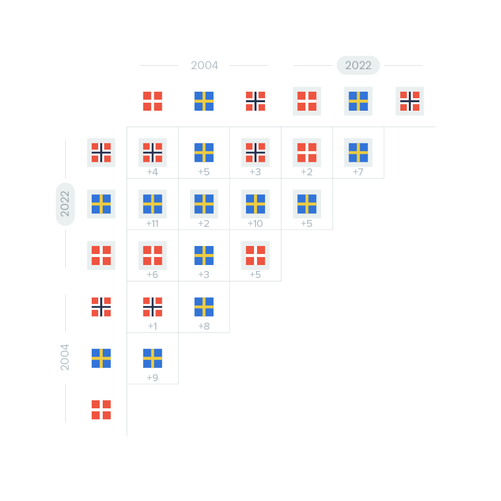
In a matrix diagram, we compare all data points, country and year, and display the countries which has the most. The difference between the two data points are written underneath.
In a matrix diagram, we compare all data points, country and year, and display the countries which has the most. The difference between the two data points are written underneath.
